Farmer’s Markets
Some Quick Visualizations
Growing up in a small town surrounded by farms and field crops, the running joke at the high school was that we had more cows than students (probably not true but it’s pretty close!). Supporting locally grown produce was always a big thing in our area. Curious to see where else in the state I could look for more fresh vegetables, here are the results of my search.

Each dot on the chart represents one farmer market location. Unfortunately as of the making of this post, vega-lite is not supportive of interactivity so altair charts are static. That being said, check back often and maybe one day it’ll suddenly have extra content as I see from my local environment! The big critique about this map I’ve made is that there is no function to zoom in/out. Unlike other altair maps, this one is built with geodata involved and is still a work-in-progress with limited features. The background projection of Massachusetts is also one I made myself as the current libraries only support all of United States which makes our region of interest too small to really make much sense of, especially without a zoom in feature available.
For an interactive version, please go to this online vega editor and paste in the following text file. Select the option at the top left that says ‘vega-lite’ and click ‘RUN’ after pasting in the document. Then you should get a visualization where hovering over datapoints shows the location and city of the farmer’s market along with a website link if available. The drop down menu is also available to get a closer look if you are ever unsure where to get started.
I had originally made the graph with ipywidgets and contextily but unfortunately it is impossible to transport the widget and maintain its interactivity. However, as you will see from the image below, contextily allows for creating a background much like one that might be found in Google maps or other such services and is more visually appealing than the bland gray blocks and white contour outlines I have created.
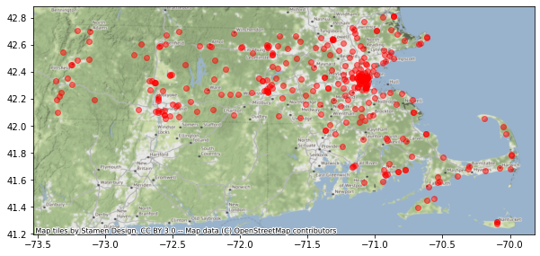
For individuals interested in seeing this particular rendering with a more realistic map background, please try out the code below in a jupyter notebook or another python environment of your liking.
import numpy as np
import pandas as pd
import matplotlib.pyplot as plt
import geopandas
import ipywidgets
import contextily as ctx


mass = geopandas.read_file("https://arcgisserver.digital.mass.gov/arcgisserver/rest/services/AGOL/Massachusetts_Counties/MapServer/0/query?outFields=*&where=1%3D1&f=geojson")
markets = geopandas.read_file("https://arcgisserver.digital.mass.gov/arcgisserver/rest/services/DPH/DPH_Farmers_Markets/MapServer/0/query?outFields=*&where=1%3D1&f=geojson")

markets_subset = markets.loc[markets["TYPE"]!="Farmers Markets"]

@ipywidgets.interact(btype=sorted(set(markets['TOWN'].unique())))

def interact_plot(btype):
    markets_subset = markets.loc[markets["TOWN"]==btype]
    fig, ax = plt.subplots(1, 1, figsize=(10,10))

    mass.plot(ax=ax, alpha=0.5, edgecolor='k')
    markets_subset.plot(column="TOWN", ax=ax, cmap='rainbow', categorical=True, legend=True)

    ctx.add_basemap(ax=ax, crs=markets.crs.to_string())

    plt.show()
The data regarding farmer’s markets is taken from Arcgis with geojson data for my altair base projection coming from here and knitting services for putting together the pieces of Massachusetts from here